For all three stone variations here, most of the work was done with just 3 colours: black, grey, and an off-white. I rarely use white except for mixing into colours, as it will end up with the stone getting too bright and drawing attention away from the miniature.
Especially when I’m trying to work fast, I try to pick a shadow, midtone, and highlight colour, then mix between the three of them. This is known as a colour triad and is a great way to start working on most pieces.
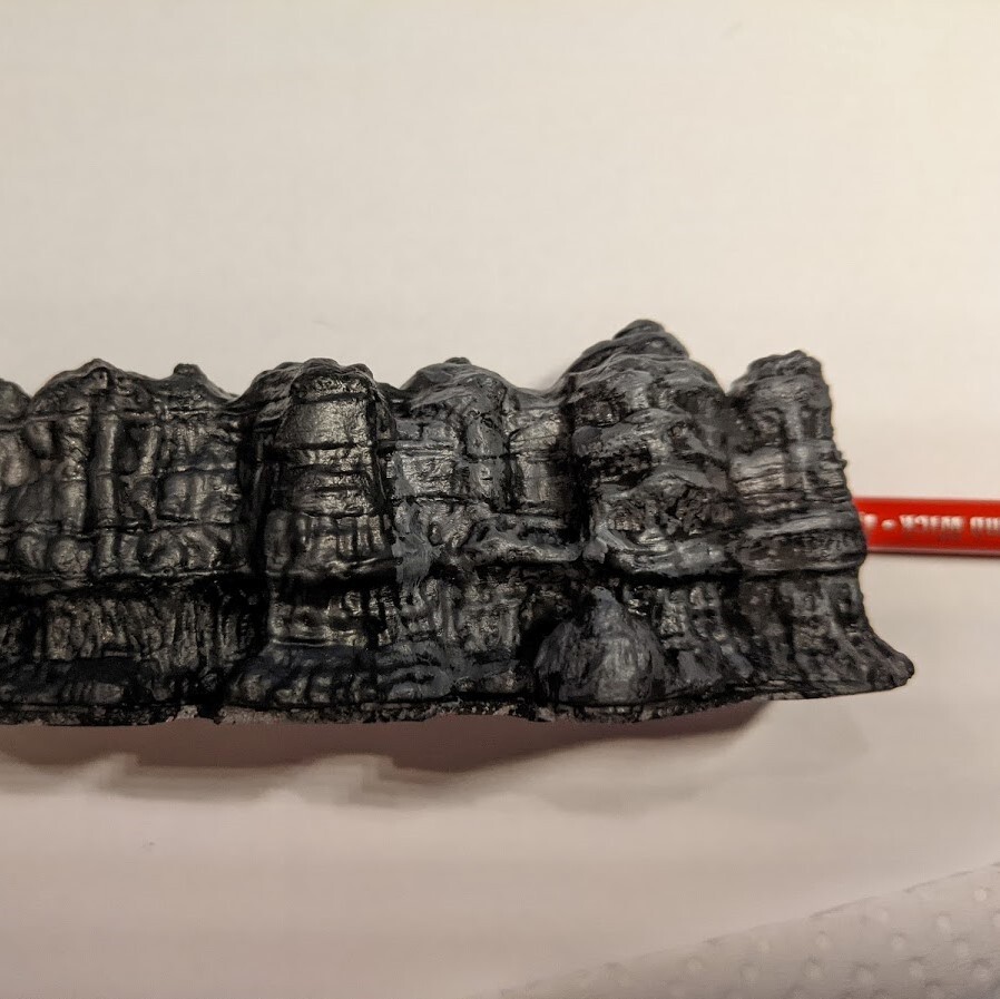
First, apply your darkest colour, making sure to get it into all the crevices of your miniature. I like mixing a bit of black into it to make it cover better, with just one coat. In this case, I use pure black.
Here’s a quick snapshot of what it looked like at this point, along with what I generally use when painting stone. I did not use the makeup brush at all, so this was done entirely with a size 3 brush.

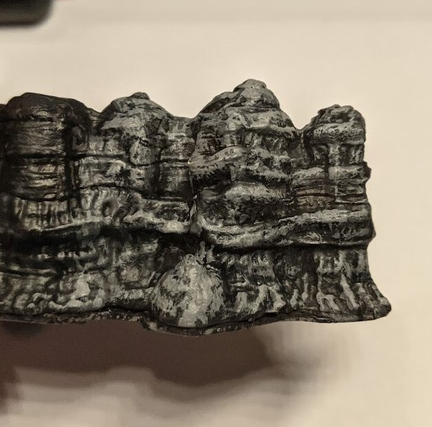
Second, mix your darkest colour (your shadow colour) and your middle colour (your midtone) 1:1 and apply it all over your piece, except for the darkest part of the miniature. You don’t have to be especially precise when doing this.
Third, apply your midtone colour. You want to apply it in a smaller area than your previous colour, drawing lines and dots along the outer edges of the piece, and along the upper parts that receive more light. At this point, I’m using pure grey.
You can see how messy I am, and see where I left some of the previous colour showing through. That’s intentional!
Quite a lot of people will stop at this stage and that’s alright, but if you want to work your stone colours a bit more, keep going.
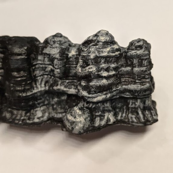
In the fourth step, I jump straight to applying highlights using the brightest colour that I have. This is the titanium buff that we have not been using at all so far.
In this step, we are applying the paint to the brightest spots on the rock, as well as within the areas we painted earlier, to better simulate a rough texture.
Make sure to remove the majority of the paint from your brush before you touch the piece, so that it is easier to control and does not flood the piece with paint. I keep a wet paper towel to wipe my brush off when painting for this reason.
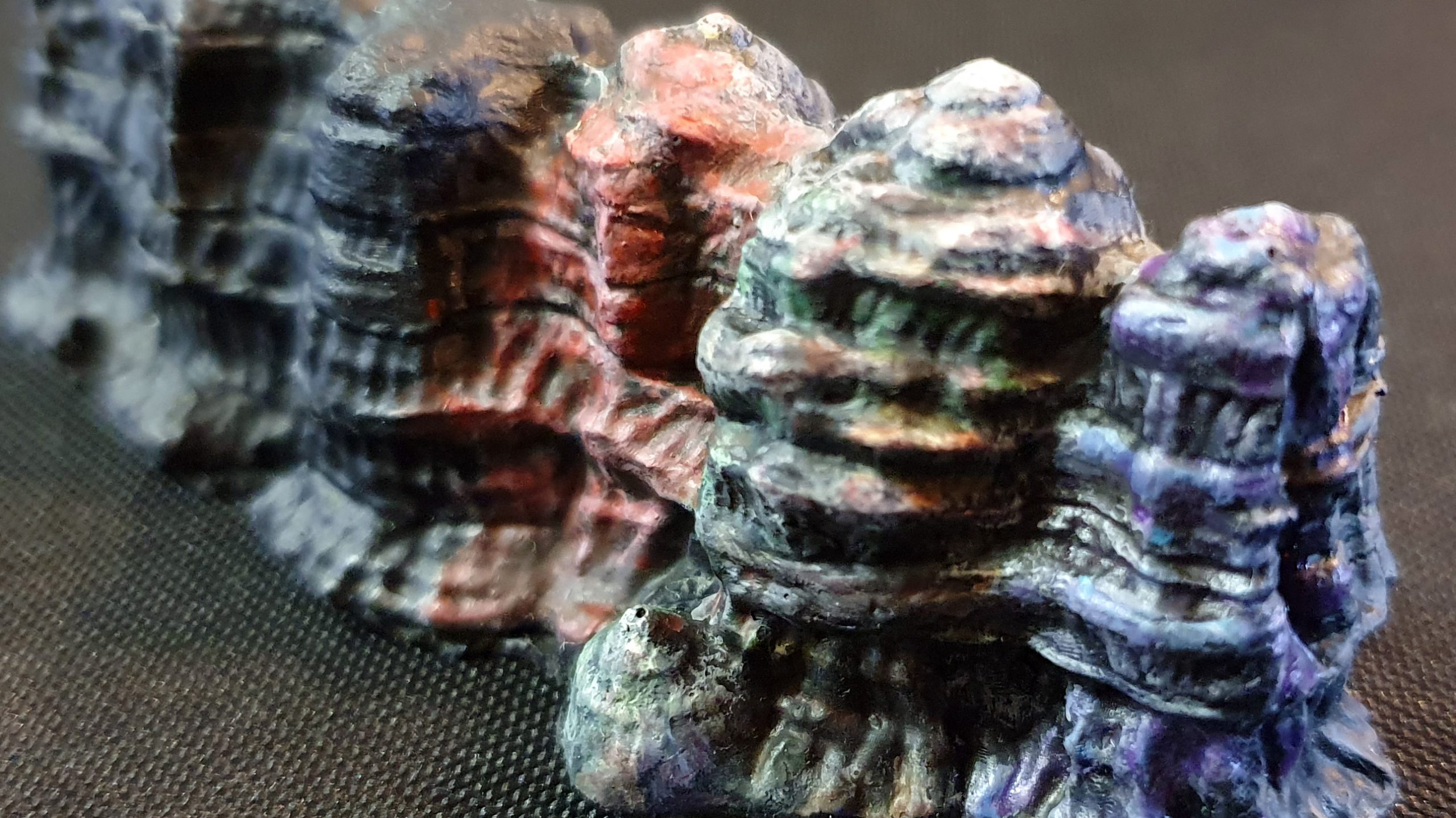
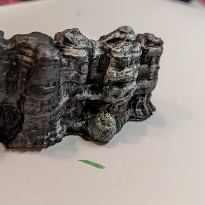
You can see the contrast on the middle part of the stone, where I’ve done the highlights, as compared to the pieces on either side of it.
If what you want is pure grey stone, you’re done!
On the other hand, I love adding colours to my stone pieces to give them a more interesting look. If what you are painting is a miniature base, you can use some of the colours from your piece in this part of the process to make it look more cohesive.
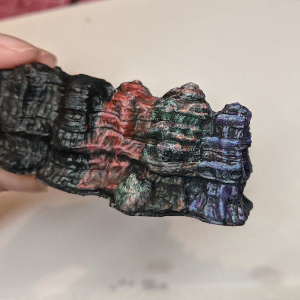
For this example, we will be adding red and green to the stone.
We will first need to thin down the paint to a glaze, by adding water until it becomes a lot more translucent. Rather than using a strict recipe, I thin it down until the colour stains a piece of paper rather than covering it solidly.
I then applied the green to the piece, deciding to use it more on the darker parts of the stone rather than the brighter parts. This is a pretty relaxed part of the process and you don’t have to be too precise about it.
Remember to wipe the paint off the brush when working, as it’s quite likely to flood the piece when it’s thinned down.
The same thinning advice applies to the red paint as well.
I most applied it to the highlighted areas, as well as to the right side of the piece, to simulate reddish light hitting the raised parts of the stone.
When you first apply the paint, it might seem extremely bright and saturated. Don’t worry, just leave it to dry, it’ll darken over time.
It’s also common to accidentally go over the brightest spots and dull them down too much in this stage. If you feel that you’ve lost too much contrast, you can simply reapply the highlight colour again. Don’t be afraid to go back and make tweaks once the paint is dry.

And… done.
Once I was done with this part, I went back and applied the steps to other pieces of rock in order to show how you might do different kinds of stone colours.
These are the colours I used to glaze on each piece.
Left: Burnt Umber, Cadmium Red Deep (you probably want to avoid using cadmium red if you like licking brushes)
Right: Formula P3 Bad Bruise, Formula P3 Arcane Blue
Note: For terrain painting, I tend to use student acrylic paints. They are a little thicker and more matte than craft paints, which many people enjoy. I find that they’re also easier to mix colours with, and are a lot cheaper than using miniature paints for larger pieces.
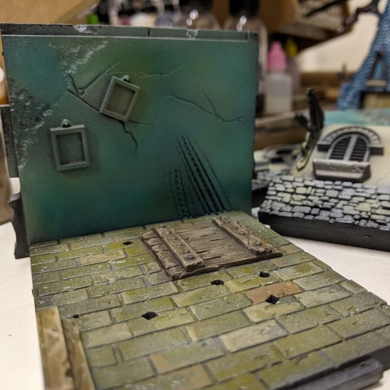
Here’s an example of a piece I painted similarly, but with an airbrush. Experiment and have fun figuring out your own favourite colour combinations!
Comments are closed